Advanced Charting and Graphing with Qvista

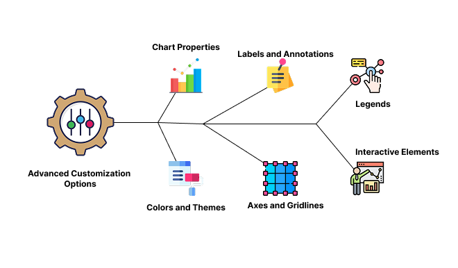
Qvista offers a robust suite of advanced charting and graphing options, designed to transform raw data into visually compelling and actionable insights. By leveraging Qvista’s extensive range of chart types and customization options, users can effectively communicate data-driven stories and support decision-making processes.

Key Features of Qvista’s Advanced Charting and Graphing

Wide Range of Chart Types

Qvista provides numerous chart options, including:

Bar Charts

Ideal for comparing quantities across categories.

Line Charts

Great for showcasing trends and changes over time.

Pie Charts and Donut Charts

Useful for displaying proportions and distributions.

Scatter Plots

Perfect for illustrating correlations between variables.

Area Charts

Highlight changes over time with filled regions under the line.

Bubble Charts

Show data with three variables, using bubble size to indicate the third dimension.

Heat Maps

Visualize data density or patterns using colors.

waterfall Charts

Illustrate cumulative effects of sequential values, ideal for financial analysis.

Advanced Customization Options
  • Chart Properties: Customize chart properties to align with specific data presentation needs, including.
  • Colors and Themes: Tailor colors, gradients, and themes to match your brand identity.
  • Labels and Annotations: Add labels, data markers, and annotations for clarity and context.
  • Axes and Gridlines: Customize axis scales, units, and labels; adjust gridlines for better readability.
  • Legends: Configure legends to highlight key data categories or series, ensuring clear interpretation.
  • Interactive Elements: Add tooltips, hover effects, and click actions to make charts interactive and user-friendly.
Dynamic Filtering and Drill-Down Capabilities
  • Real-Time Filtering: Apply filters directly on the charts to focus on specific data segments without needing to reload data.
  • Drill-Down Functionality: Enable users to explore underlying data by drilling down into chart elements for deeper insights.
Data-Driven Customization
  • Supports conditional formatting to dynamically adjust chart colors based on data values (e.g., highlighting trends, anomalies, or thresholds).
  • Set up custom formulas and calculations to derive insights directly within the charts.
Data-Driven Customization
  • Supports conditional formatting to dynamically adjust chart colors based on data values (e.g., highlighting trends, anomalies, or thresholds).
  • Set up custom formulas and calculations to derive insights directly within the charts.
Interactive Dashboards with Embedded Charts
  • Integrate charts into interactive dashboards that update in real-time as data changes.
  • Embed charts into web pages, intranet portals, or BI tools to extend data accessibility.
Export and Sharing Options
  • Export charts in various formats, including PDF, PNG, or Excel, for reports, presentations, or offline analysis.
  • Share charts through secure, shareable links or embedded widgets for collaboration with stakeholders.
Accessibility and Cross-Platform Compatibility
  • Ensure charts are accessible to all users, including those using screen readers, with proper ARIA labels and keyboard navigation.
  • Charts are responsive and optimized for viewing across devices—desktop, tablet, and mobile—ensuring consistent user experience everywhere.

Benefits of Using Qvista’s Charting and Graphing Capabilities

  • Transform complex data sets into clear visual representations that are easy to understand and interpret.
  • Help stakeholders make informed decisions by presenting data in a visually engaging way.

  • Interactive and customizable charts capture user interest, encouraging deeper data exploration and engagement.
  • Drill-downs and filters enable users to navigate through data, uncovering insights and patterns that static reports might miss.

  • Qvista’s real-time charting ensures users are always working with the most current data, enabling quick responses to changes and trends.
  • Automated updates and dynamic filtering save time, allowing users to focus on analysis rather than manual data manipulation.

  • Share visualizations and dashboards with team members, clients, or executives to foster collaboration and alignment.
  • Customizable export options allow teams to easily include charts in reports, presentations, and decision-making processes.

  • Adapt charts to emphasize the most critical KPIs, metrics, and trends relevant to your organization’s objectives.
  • Tailor visualizations for different departments (e.g., marketing, sales, finance) to address their unique reporting requirements.

  • Connect Qvista charts directly with various data sources such as Google Sheets, databases, and APIs.
  • This ensures your visualizations are always pulling from the most relevant and up-to-date information without manual imports.